

If your WordPress site looks amateur, you might be overusing stock photos, which can feel impersonal. Ignoring mobile optimization is another mistake; a responsive design is essential. Cluttered layouts confuse visitors, while inconsistent branding can weaken your message. Finally, neglecting typography affects readability and user experience. Addressing these key areas will elevate your site’s professionalism. Stick around, and you’ll discover how to tackle each mistake effectively for a more polished online presence.
Overusing Stock Photos: How to Choose Authentic Imagery

While stock photos can save time and effort, relying too heavily on them can make your site feel impersonal and generic.
To create a more engaging experience, focus on authentic visuals that reflect your brand’s personality. Start by considering your audience—what resonates with them?
When image sourcing, look for photos that tell a story or evoke emotion. Don’t shy away from using original images, even if it means investing a bit more time. You could use a smartphone to capture candid moments or hire a local photographer for a unique touch. Additionally, consider using clean and modern fonts to enhance the overall aesthetic of your site.
Ignoring Mobile Optimization: Why It Matters for Your Design
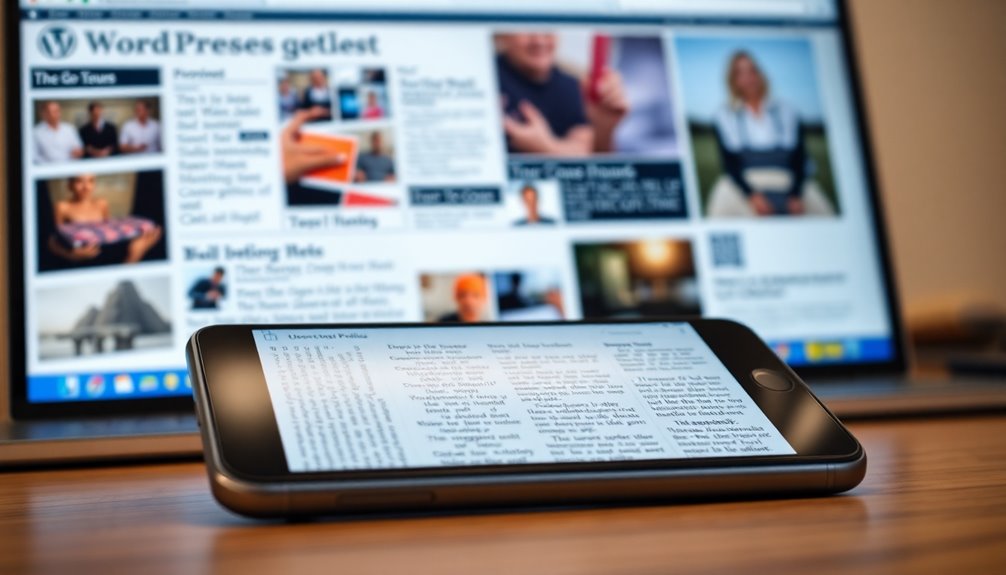
Ignoring mobile optimization can drastically impact your site’s performance and user experience. With more users browsing on mobile devices, you can’t afford to overlook this vital aspect.
Neglecting mobile optimization can severely hinder your site’s performance and user satisfaction in today’s mobile-centric world.
Implementing responsive design guarantees your site looks great on any screen size. Here are key elements to take into account:
- Mobile first approach: Design for small screens first, then scale up.
- Viewport settings: Proper configurations help browsers render your content correctly.
- Touch targets: Make buttons and links large enough for easy tapping.
- Load speed: Optimize images and scripts to reduce load time on mobile.
- User experience: A seamless mobile experience keeps visitors engaged and encourages conversions.
Prioritizing mobile optimization elevates your site from amateur to professional. Additionally, a clean design ensures that your mobile site remains visually appealing and functional across devices.
Cluttered Layouts: The Importance of White Space in Design
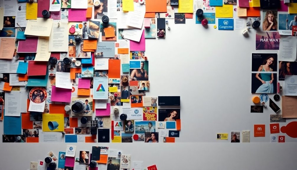
Many designers overlook the power of white space, leading to cluttered layouts that overwhelm visitors.
White space isn’t just empty space; it’s an essential design element that creates visual balance.
When you use effective spacing techniques, you guide your audience’s eyes to key content.
A clean layout allows users to focus on what matters without distractions. Additionally, a well-structured design can enhance site speed and improve overall user engagement.
Inconsistent Branding: How to Maintain a Cohesive Look
Consistent branding is essential for creating a professional image that resonates with your audience.
To maintain a cohesive look across your WordPress site, follow these strategies:
- Establish brand guidelines that define your visual identity.
- Choose a color palette that reflects your brand’s personality and stick to it.
- Ensure logo placement is consistent across pages for immediate recognition.
- Maintain a clear visual hierarchy to guide users through your content effectively.
- Use similar imagery styles to strengthen brand association.
Regularly updating content signals site activity to search engines, enhancing your overall SEO effectiveness and brand credibility.
Neglecting Typography: Choosing Fonts That Enhance Readability
Typography plays an essential role in shaping your website’s overall user experience. If you neglect it, your site can come off as unprofessional.
Start by choosing fonts that enhance readability. A good rule of thumb is to use a combination of fonts for headings and body text—this is known as font pairing.
Choose fonts that enhance readability by pairing distinct fonts for headings and body text to create visual harmony.
Make certain your headings are distinct and create a clear readability hierarchy. This not only guides your visitors’ eyes but also emphasizes important information.
Avoid overly decorative fonts that can confuse readers. Stick to web-safe fonts that load quickly, and guarantee your text size is appropriate for all devices.
Ultimately, thoughtful typography invites engagement and keeps your audience on your site longer. Additionally, incorporating performance optimization plugins can further enhance user experience by ensuring fast loading times.
Conclusion
So, as you begin your WordPress journey, remember that even the great Michelangelo started with a rough sketch. Avoid these design pitfalls, and your site will shine like the Sistine Chapel. Choose authentic images, optimize for mobile, embrace white space, maintain consistent branding, and select readable fonts. With these tips, you’ll craft a site that’s not just functional but also a true reflection of your vision. Let your creativity flow, and watch your website transform!