
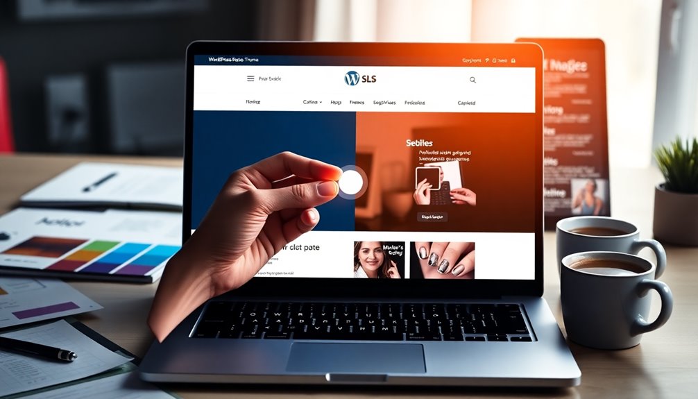
You can easily add a dark/light mode toggle to your WordPress theme by using a plugin or custom CSS. Start by selecting a suitable plugin that fits your theme and offers user customization options. Design your toggle for easy access, ensuring it has good color contrast. Use CSS variables to manage colors efficiently, and save user preferences in local storage. By enhancing your site’s accessibility and aesthetics, you’ll elevate user experience—let’s explore more ways to optimize your theme further.
Understanding the Importance of Dark/Light Mode
As you plunge into web design, you’ll quickly realize that offering a dark/light mode toggle isn’t just a trendy feature; it considerably enhances user experience. By catering to user preferences, you make your site more accessible and enjoyable.
Design psychology shows that different light settings can affect mood and focus. For instance, dark mode can reduce eye strain in low-light environments, while light mode feels more vibrant in bright settings. By understanding these nuances, you create a welcoming atmosphere that aligns with users’ needs. Additionally, security breaches can be mitigated by providing users with a comfortable browsing experience that encourages longer visits.
Implementing this toggle not only boosts usability but also demonstrates your commitment to a thoughtful design approach, inviting users to engage more deeply with your content.
How Dark/Light Mode Enhances User Experience
Offering a dark/light mode toggle can considerably enhance user experience by allowing visitors to choose an interface that suits their environment and preferences. This flexibility aligns with user preferences, making your site more inviting and improving visual comfort.
By catering to different moods and lighting conditions, you can leverage color psychology for mood enhancement, encouraging longer visits. This adaptability also strengthens brand identity, as users associate your site with thoughtful design choices.
Additionally, implementing design consistency across modes fosters familiarity, boosting user retention. Finally, accessibility features in dark/light modes guarantee everyone can engage with your content easily, breaking down barriers and making your site inclusive for all. Moreover, regular updates ensure that the toggle feature remains secure and functional, enhancing overall user satisfaction.
Choosing the Right Method for Implementation
When it comes to adding a dark/light mode toggle, you have several options to evaluate.
You can use built-in WordPress features, explore custom CSS solutions, or tap into JavaScript libraries.
Each method has its own advantages, so let’s weigh them to find what suits your needs best. Additionally, consider the benefits of regularly updating themes to ensure compatibility and security with your toggle implementation.
Built-In WordPress Features
While you might think adding a dark/light mode toggle is a complex task, WordPress provides several built-in features that simplify the process. You can leverage theme customization options to align the toggle with your branding consistency.
Consider user preferences and color psychology when choosing your palette, guaranteeing a visually appealing experience. Accessibility considerations are vital, as a well-designed toggle enhances usability for all users.
Plus, make sure your design is mobile responsive, as many users browse on their phones. Finally, keep an eye on the performance impact; efficient integration will help maintain your site’s speed.
Custom CSS Solutions
Custom CSS solutions provide a flexible way to implement a dark/light mode toggle in your WordPress theme. By utilizing custom styles, you can tailor color schemes that enhance theme aesthetics and cater to user preferences.
This method guarantees visual contrast, making content readable in both modes.
- Focus on responsive design for various devices.
- Maintain design consistency across all pages.
- Conduct usability testing to fine-tune the toggle design.
Adhering to coding standards while implementing these solutions will improve the overall functionality of your theme.
JavaScript Libraries Options
If you’re looking to implement a dark/light mode toggle, leveraging JavaScript libraries can simplify the process considerably. Consider using lightweight libraries like jQuery or Vanilla JS for their ease of use.
These options often offer excellent theme compatibility and cross-browser support, ensuring your toggle works seamlessly across different devices. Pay attention to user preference; storing their choice in local storage can enhance the experience.
Incorporating toggle animations can also make the shift smoother. However, be mindful of the performance impact; heavier JavaScript frameworks might slow down your site.
Finally, familiarize yourself with debugging techniques to troubleshoot any issues that arise during implementation. This approach will help you create a functional and user-friendly toggle feature.
Adding a Dark/Light Mode Plugin to Your WordPress Site
When adding a dark/light mode plugin to your WordPress site, it’s essential to select the right one that fits your needs. Once you’ve made your choice, you’ll need to configure the display settings to guarantee it works seamlessly with your theme. Additionally, ensure that the plugin is SEO-friendly to maintain your site’s search engine visibility. Let’s explore how to make these selections effectively.
Selecting the Right Plugin
Choosing the right plugin for adding a dark/light mode toggle to your WordPress site can make a significant difference in user experience. You’ll want to evaluate several factors to guarantee the best choice for your needs:
- Plugin Compatibility: Confirm it works seamlessly with your current theme and other plugins.
- User Preferences: Look for options that allow for user customization to enhance engagement.
- Support Resources: Check for active support and regular feature updates to address any issues.
Reading plugin reviews can offer insights into theme performance and design consistency as well.
Don’t forget to look for troubleshooting tips during the installation process to streamline your experience. Making an informed decision will help you create a more enjoyable site for your visitors.
Configuring Display Settings
To configure the display settings after adding a dark/light mode plugin to your WordPress site, you’ll want to explore the plugin’s settings menu.
Here, you’ll find options to adjust your display preferences, allowing you to tailor the experience to your visitors. Most plugins offer a simple toggle for users to switch between modes, but you might also see options for automatic switching based on time or user location.
Don’t forget to check for user customization features, which let visitors save their preferred mode. This can enhance user experience and keep them coming back.
After making your adjustments, preview your site to verify everything looks great. Once satisfied, save your changes, and you’re all set to offer a stylish, user-friendly interface!
Customizing Your Theme for Dark/Light Mode
Customizing your theme for dark and light mode can greatly enhance user experience, making your website more accessible and visually appealing.
By catering to user preferences, you can create a more inviting atmosphere. Here are a few key aspects to contemplate when adjusting your color scheme:
Catering to user preferences fosters an inviting atmosphere, enhancing the overall experience of your website.
- Contrast: Guarantee text stands out against background colors for readability.
- Palette: Choose colors that complement both modes, providing a seamless shift.
- Consistency: Maintain visual elements across modes to keep the user experience cohesive.
Additionally, consider how font readability can significantly impact user engagement and overall satisfaction.
Coding a Dark/Light Mode Toggle Manually
Adding a dark/light mode toggle to your WordPress theme enhances the user experience even further.
Start with a clean toggle design that’s easy to implement and visually appealing. Consider user preferences by allowing them to switch modes effortlessly. Guarantee good color contrast for readability; this helps meet accessibility standards and improves overall usability.
When coding, adhere to best coding practices to maintain performance considerations, guaranteeing your site loads quickly, regardless of the mode. Don’t forget to test your theme customization across devices to guarantee consistency. Additionally, optimizing site speed is crucial, as it ensures a seamless experience for users regardless of their chosen viewing mode.
Utilizing CSS Variables for Theme Switching
Using CSS variables for theme switching streamlines your design process by allowing you to easily manage colors and styles. You’ll find that implementing a theme switcher with these variables not only enhances flexibility but also simplifies your code. Additionally, this method aligns well with Astra’s extensive documentation, ensuring you have all the resources you need for successful implementation. Let’s explore the advantages and how to set up the switcher effectively.
Advantages Of CSS Variables
CSS variables offer a powerful solution for implementing theme switching in your WordPress site. By leveraging CSS variables, you can enhance theming benefits while ensuring design consistency and responsiveness.
Here are a few advantages to evaluate:
- Dynamic Styling: Easily switch between light and dark modes without extensive code changes.
- Performance Optimization: Reduce CSS file size, improving load times and user experience.
- User Preference: Allow users to personalize their visual identity, enhancing engagement.
With custom properties, you can adjust color contrast and maintain a cohesive design across various elements.
This flexibility not only streamlines your workflow but also elevates your site’s overall aesthetic, making it a win-win for you and your visitors.
Implementing Theme Switcher Code
With the advantages of CSS variables in mind, implementing a theme switcher becomes straightforward. Start by defining your color variables in your CSS, like `–background-color` and `–text-color`.
Then, create two sets of variables: one for light mode and another for dark mode.
Next, leverage JavaScript to toggle these variables based on user preference. Use event listeners to detect clicks on your theme switcher toggle. When clicked, switch the CSS variables accordingly, applying the desired implementation strategies.
Make sure to save the user’s preference in local storage, so their choice persists across sessions.
Integrating JavaScript for Toggle Functionality
To create a seamless dark/light mode toggle in your WordPress theme, you’ll need to integrate some JavaScript that responds to user input. This involves setting up event listeners to capture clicks on your toggle.
Integrating JavaScript for a dark/light mode toggle enhances user interaction and captures preferences effectively.
You’ll also want to manage the state effectively to remember user preferences across sessions, guaranteeing theme persistence.
Here are some key points to reflect on:
- Toggle animations can enhance the user experience, making shifts smooth.
- Keep performance considerations in mind, so the toggle doesn’t slow down your site.
- Verify cross-browser compatibility and mobile responsiveness to reach all users effectively. Additionally, consider implementing security plugins to ensure that your site remains protected while adding new features.
Ensuring Accessibility With Your Toggle
While implementing a dark/light mode toggle can enhance user experience, it’s important to guarantee that the feature is accessible to everyone.
Start by adhering to accessibility standards, ensuring your color choices meet the required contrast ratios. This means that text should stand out clearly against its background, making it readable for users with visual impairments.
Utilize tools like contrast checkers to verify that your color schemes comply with WCAG guidelines.
Also, consider adding a text label to the toggle switch, explaining its function. This way, users will understand the purpose, improving navigation. Additionally, ensure that your toggle aligns with accessibility standards to maximize usability for all visitors.
Testing Your Dark/Light Mode Implementation
As you implement the dark/light mode toggle, testing its functionality is essential to confirm a seamless user experience.
You’ll want to ascertain that both dark mode usability and light mode aesthetics meet user preference while maintaining theme consistency.
Here are some key testing points to reflect on:
- Color contrast: Confirm that text remains legible in both modes.
- Visual comfort: Check that users feel at ease during prolonged use in either mode.
- Accessibility standards: Verify that your toggle complies with guidelines for all users.
- Security considerations: Ensure that the toggle implementation does not introduce new vulnerabilities that could compromise WordPress security.
Optimizing Performance for Dark/Light Mode
Optimizing performance for dark/light mode is essential, especially since a seamless experience can greatly enhance user satisfaction.
Focus on performance metrics to track load times and memory usage, ensuring your site runs smoothly. Effective resource management helps balance design flexibility with theme responsiveness, allowing users to switch modes without lag.
Implement code optimization techniques to reduce unnecessary scripts and styles, which can improve browser compatibility across devices. Aim for visual consistency in both modes to maintain user preferences and aesthetic appeal.
Addressing Common Issues With Dark/Light Mode
Implementing a dark/light mode toggle can lead to some common challenges that you’ll want to address for a smooth user experience.
It’s important to recognize that users have varying light mode preferences and may face issues switching modes.
- Inconsistent Color Schemes: Make sure colors are readable and visually appealing in both modes.
- User Settings: Save users’ preferences so they don’t have to toggle every visit, enhancing the dark mode benefits.
- Accessibility Concerns: Test both modes for accessibility to accommodate all users, including those with vision impairments.
Encouraging User Engagement With Theme Options
To keep your visitors engaged, offering theme options like dark and light mode can greatly enhance their experience.
When users can tailor the appearance to their preferences, they’re likely to spend more time on your site.
This small change can lead to a more enjoyable browsing experience and encourage repeat visits.
Enhance User Experience
While users often have diverse preferences when it comes to site aesthetics, providing a dark/light mode toggle can greatly enhance their experience. This simple feature not only caters to individual user preferences but also boosts visual comfort and aligns with current design trends.
By giving users control over their viewing environment, you enhance aesthetic appeal and strengthen your brand identity.
- Health benefits: Reduces eye strain, especially in low-light conditions.
- Personalization options: Allows users to tailor their experience.
- User feedback: Engages your audience by considering their needs.
Ultimately, a dark/light mode toggle minimizes cognitive load, making your site more enjoyable and user-friendly.
Increase Time Spent
A well-implemented dark/light mode toggle can greatly boost the time users spend on your site. By catering to diverse color preferences, you enhance visual comfort, which is essential for user behavior.
This aligns with design psychology, as it taps into user habits and interaction patterns, making your site more appealing. When users feel comfortable, they’re more likely to explore your content, increasing engagement.
Incorporating this feature into your theme aesthetics not only reinforces your visual identity but also aligns with current preference trends.
Effective engagement strategies, like offering a toggle, encourage users to linger longer, ultimately improving their overall experience. By acknowledging and adapting to user needs, you’ll foster a connection that keeps them returning to your site.
Updating Your Theme for Future Compatibility
As you implement a dark/light mode toggle, guaranteeing your theme is built for future compatibility is essential. This means adopting future-proofing strategies and considering compatibility with upcoming browser updates.
Here are some key points to keep in mind:
- Design Adaptability: Make sure your theme can easily adjust to changing user preference trends.
- Responsive Design: Prioritize mobile and tablet experiences to maintain usability across devices.
- Code Maintenance: Regularly update your theme to guarantee it remains flexible and functional.
Collecting User Feedback on Theme Preferences
How can you guarantee your dark/light mode toggle meets user expectations? Start by actively collecting feedback on user preferences.
Utilize user surveys to gather insights about their experiences and preferences regarding your theme’s design choices. Analyze this data to identify preference trends and make informed adjustments.
Conduct usability testing with your audience to observe how they interact with the toggle, focusing on ease of use and satisfaction.
Encourage audience engagement by inviting feature requests and improvement suggestions, making users feel valued.
Incorporating their feedback into your theme analysis not only enhances user satisfaction but also fosters a community around your product.
Conclusion
Incorporating a dark/light mode toggle into your WordPress theme isn’t just a trendy move; it’s practically a rite of passage for modern webmasters. After all, who wouldn’t want to cater to users’ whims while pretending to be a coding wizard? So go ahead, flip that switch and watch your visitors bask in the glow of their preferred setting. Just remember, in the grand scheme of the internet, you’re not just a theme developer—you’re a beacon of user comfort.