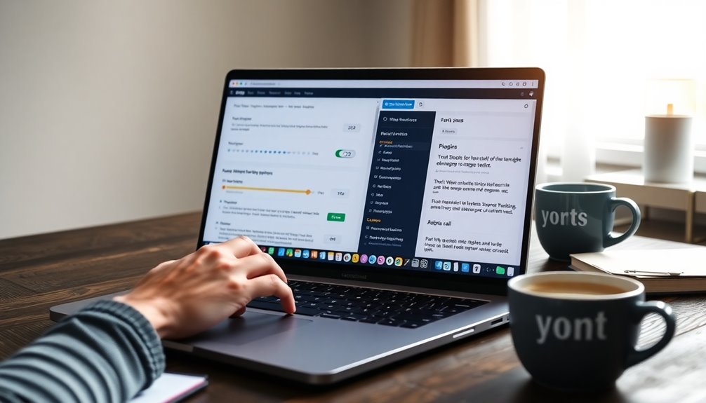
Changing the font size in WordPress is easy and can boost your site's readability. If you're using the Gutenberg editor, you can adjust sizes in the Typography settings found in the right sidebar. For the Classic Editor, simply use the Paragraph dropdown menu. You can also try plugins like Advanced Editor Tools for more control. If you're comfortable with CSS, add custom code in the Appearance > Customize > Additional CSS section. Remember to maintain good contrast and use appropriate font sizes for better accessibility. Want to explore more options for customizing your fonts?
Importance of Font Size
When it comes to designing your WordPress site, understanding the importance of font size can't be overlooked. Proper font size directly impacts readability, and using at least 16px for body text guarantees clarity across devices. This not only enhances content comprehension but also establishes a visual hierarchy that guides users through your site, improving user engagement. Additionally, implementing strong passwords is crucial to securing your content against unauthorized access. A well-structured blog design, such as using themes like Astra, can further enhance user experience by ensuring that font sizes are appropriately utilized.
Accessibility is another vital aspect; appropriately sized fonts make your content more inclusive, benefiting visually impaired users. Furthermore, larger font sizes can effectively highlight key information and calls to action, boosting interaction and conversion rates.
Remember, search engines favor readable content, so well-structured font sizes can positively influence your SEO rankings and overall site visibility. Additionally, optimizing site speed can enhance user experience as site speed directly correlates with user satisfaction and engagement. Make the most of your WordPress editor and custom CSS to optimize font size.
Methods to Change Font Size
Adjusting font size in WordPress is straightforward, and knowing how to do it can greatly enhance your site's readability and visual appeal.
You can change font sizes using the Gutenberg Block Editor by accessing the Typography settings in the block's three-dot menu, where you'll find options like small, medium, large, and extra-large. Widget selection plays a crucial role in ensuring that the changes you make align with your website's overall design.
In the Classic Editor, modify font sizes through the Paragraph dropdown menu for basic heading changes.
If you want more flexibility, consider the Advanced Editor Tools plugin for enhanced controls. This plugin can also help with content engagement by allowing you to create visually appealing layouts.
Additionally, custom CSS allows you to change font sizes site-wide via Appearance > Customize > Additional CSS.
For responsive design, apply media queries to set different font sizes based on screen sizes, ensuring ideal readability. By utilizing custom CSS for precise styling adjustments, you can enhance the visibility of your text elements even further.
Using the Gutenberg Editor

While maneuvering the Gutenberg Editor, changing font sizes is a simple yet effective way to enhance your content's appearance.
To adjust font sizes, select the text block you wish to edit and navigate to the Typography settings in the right-hand sidebar. Here, you'll find predefined size options like Small, Medium, Large, and Extra Large. Elegant typography plays a crucial role in creating an appealing visual experience. Additionally, choosing a theme with SEO-friendly features can help ensure that your site's design does not hinder its search engine performance.
If you need more precision, use the custom size setting to input specific values in px, em, or rem. When working with headings, utilize the Heading block for larger text sizes.
Plus, the real-time previews allow you to see font size adjustments instantly, ensuring your WordPress posts look just right before publishing.
You can also revert to default font size settings with one click. Additionally, using customizable themes like Astra can further enhance your website's overall typography and design.
Using the Classic Editor
If you prefer the Classic Editor for your WordPress site, changing font sizes can be done with a few straightforward steps.
Start by selecting the text block you want to modify and use the paragraph dropdown menu to choose from available heading sizes like H1, H2, or H3. This method is great for adjusting font sizes, especially for larger text. Implementing secure file upload solutions on your site can enhance overall integrity and user trust. Regularly using automated backups can also protect your content from unexpected data loss.
For more precise control, you can add custom CSS in the Appearance > Customize > Additional CSS section, targeting specific elements.
While the Classic Editor has limited options, you can input custom HTML code to specify sizes using 'px', 'em', or 'rem'. Additionally, it's important to ensure theme compatibility with the current WordPress version to avoid issues with text display.
Don't forget to click Update or Publish to save your changes and make them visible on your site!
Font Size Adjustments With Plugins

To enhance your WordPress site's font size options, using plugins can be a game changer. Plugins like Advanced Editor Tools and TinyMCE Advanced allow you to easily customize text size directly in the WordPress editor, streamlining your editing process. Additionally, using a font like Roboto can improve readability in body content, making it an excellent choice for your site. Regular backups of your website ensure that your font customizations and other settings are preserved against data loss, highlighting the importance of WordPress backup plugins.
If accessibility is a priority, consider Zeno Font Resizer or Accessibility Font Resizer, which let visitors adjust font sizes through a sidebar widget, greatly improving user experience.
Additionally, typography plugins like Easy Google Fonts offer extensive customization options, enabling you to change font sizes and styles without any coding knowledge. Furthermore, selecting a plugin with active installations can help ensure reliability and ongoing support for your font size adjustments.
With regular updates and active support, these plugins guarantee your font size adjustments remain effective and compatible with the latest WordPress versions.
Custom CSS for Font Changes
If you want to take control of your font sizes in WordPress, using Custom CSS is the way to go.
You can easily access it through the WordPress Customizer, where you'll find the Additional CSS option.
Understanding CSS units like em and rem will help you make effective and scalable font adjustments across your site.
Accessing Custom CSS
Accessing Custom CSS in WordPress is straightforward, as you can easily modify your site's font sizes through the Customizer.
First, head to your WordPress dashboard, select "Appearance," and then click on "Customize."
In the Customizer, locate the "Additional CSS" option. Here, you can input your custom CSS code for font size adjustments.
For example, use 'body { font-size: 1.25rem; }' to set the default size for all text or employ specific selectors like 'p { font-size: 18px; }' for paragraphs and 'h2 { font-size: 2.5em; }' for headings.
Once you've made your changes, don't forget to hit the "Publish" button to apply your typography modifications across the site.
CSS Units Explained
When it comes to changing font sizes in CSS, understanding the different units is crucial for achieving the desired look and responsiveness.
You have several options: pixels (px) provide a fixed size, great for screen media, but they lack scalability. Instead, try rem units for responsive design; they adjust based on the root element's font size, making them ideal for fluid typography.
Percentages allow for relative sizing, where 100% matches the default font size, while viewport width (vw) and viewport height (vh) units guarantee your font size adapts to screen dimensions.
Although points (pt) are mainly for print, using scalable units like rem can enhance your web design's adaptability across devices.
Best Practices for Fonts

To create a visually appealing and user-friendly website, it's essential to follow best practices for fonts.
Start by maintaining a minimum font size of 16px for body text to guarantee optimal readability.
Establish a clear font hierarchy using different heading sizes (H1, H2, H3) to enhance content organization and boost user engagement.
Limit your font variations to 2-3 types to achieve a cohesive and professional appearance.
It's important to secure sufficient contrast between text and background colors, adhering to accessibility guidelines to improve visibility and reduce eye strain.
Don't forget to regularly test font sizes across various devices to maintain a positive user experience for all visitors.
Following these practices will enhance both usability and aesthetics.
Responsive Font Sizing Techniques
Maintaining readability and aesthetic appeal is essential, especially as users access your site on various devices.
Responsive font sizing lets you adjust font sizes using CSS media queries, guaranteeing ideal readability across different screens. By utilizing relative units like 'em' and 'rem', your text scales proportionally, enhancing accessibility.
Implementing fluid typography with viewport width (vw) and viewport height (vh) units allows your fonts to adapt seamlessly, boosting mobile responsiveness.
Always test your font sizes on multiple devices to guarantee consistent readability, aiming for a minimum body text size of 16px.
Tools like Google Fonts and typography plugins make it easy to apply these techniques, improving both your site's visual appeal and user experience.
Troubleshooting Font Size Issues

Sometimes, you might find that your font size changes aren't showing up as expected.
To fix this, you'll want to check for caching issues, make certain your custom CSS is saved, and verify that any plugins are properly configured.
Common Font Size Problems
When you're designing your WordPress site, font size issues can pop up unexpectedly, making your text look inconsistent and unprofessional.
One common problem arises from theme limitations, where preset font sizes limit your typography flexibility. Additionally, responsive design settings can cause font sizes to vary across devices, requiring careful checks with media queries to maintain uniformity.
Plugin conflicts can also lead to unexpected changes in font sizes, creating confusion. Furthermore, browser rendering differences may affect how your fonts appear, emphasizing the need for cross-browser testing.
Finally, accessibility issues can arise if you use font sizes below recommended minimum sizes, which impacts readability for visually impaired users. Addressing these concerns is essential for a polished and accessible website.
Solutions for Responsive Design
To guarantee your WordPress site looks great on all devices, you need to address responsive design issues with your font sizes.
Here are some solutions to take into account:
- Use media queries in your CSS to set different font sizes for various screen sizes, enhancing readability.
- Implement responsive units like em or rem for font sizes, improving accessibility on mobile devices.
- Test font sizes with browser developer tools for real-time adjustments, ensuring ideal user feedback.
- Think about using plugins like Zeno Font Resizer for dynamic adjustments, allowing users to customize their font size based on individual needs.
Conclusion
To sum up, adjusting font size in WordPress isn't just about aesthetics; it can greatly impact readability and user engagement. You might've heard that larger fonts lead to better retention of information, and research supports this idea. By exploring the various methods available, from Gutenberg to custom CSS, you can easily find what works best for your site. So, don't hesitate to experiment with your font choices—your readers will appreciate the effort!


