

Building a mobile-first WordPress site is essential in today’s smartphone-driven world. Focus on responsive design principles, like flexible grids and media queries, to guarantee your site looks great on all devices. Choose a mobile-friendly theme with customization options that suit your style. Enhance performance with essential plugins for caching and image optimization. Streamline your content for quick access and follow best practices for mobile SEO. Discover even more tips to elevate your site’s mobile experience.
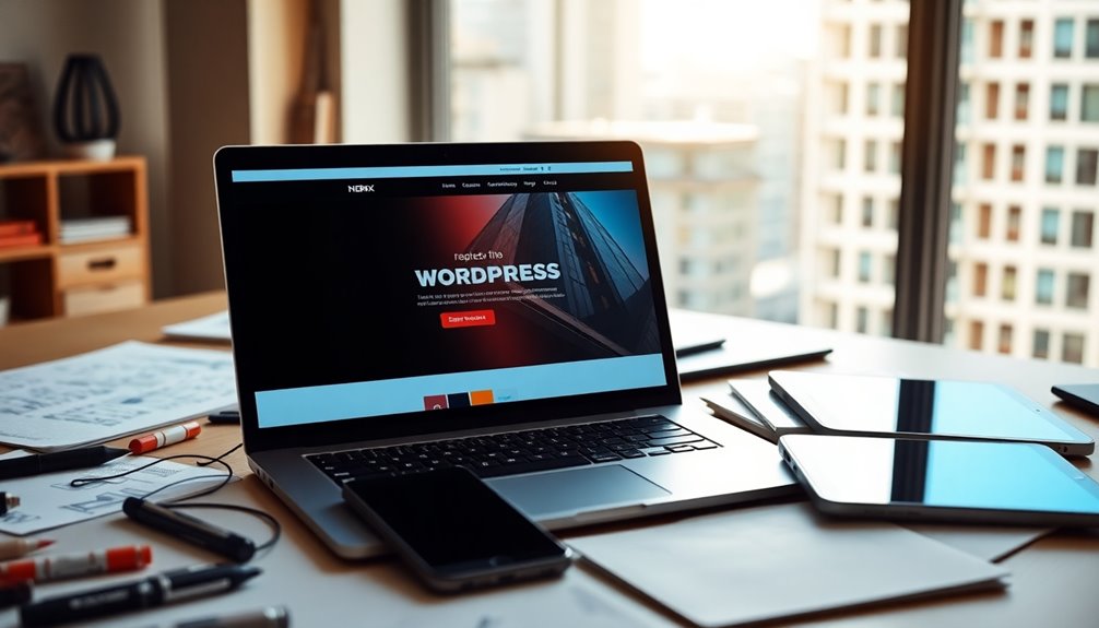
Why Going Mobile-First Is Crucial for Your WordPress Site

As more users browse the web on their smartphones than ever before, adopting a mobile-first approach for your WordPress site isn’t just smart—it’s essential.
With the rise of mobile user behaviors, your site needs to cater to on-the-go visitors who expect seamless experiences. A mobile-first mindset prioritizes design and functionality for smaller screens, ensuring that your content is easily accessible and engaging. This approach not only improves user satisfaction but also boosts your site’s performance in search rankings. When you focus on mobile users first, you’re setting the stage for better engagement, lower bounce rates, and higher conversions. Additionally, implementing SEO optimization plugins can significantly enhance your online presence and visibility.
Understanding Responsive Design Principles for Optimal Viewing
A mobile-first approach sets the foundation for understanding responsive design principles, which play a key role in delivering ideal viewing experiences across devices.
By employing flexible grids, you guarantee that your layout adapts seamlessly to various screen sizes. This adaptability allows your content to remain visually appealing and accessible, whether viewed on a smartphone, tablet, or desktop.
Additionally, using media queries helps you apply different styling rules based on the user’s device characteristics. This means you can optimize images, fonts, and layouts specifically for each screen type. Choosing customizable WordPress themes can further enhance your site’s responsiveness and functionality.
Choosing the Right Mobile-Friendly WordPress Theme

How do you choose the right mobile-friendly WordPress theme that enhances your site’s performance? Start by looking for themes that offer excellent header responsiveness, ensuring your logo and menu adapt seamlessly on smaller screens.
Prioritize theme customization options to tweak color schemes and typography choices that reflect your brand without sacrificing readability.
Check the footer layout; it should be simple yet informative, making navigation easy for mobile users.
Additionally, consider sidebar functionality; a well-designed sidebar can enhance usability but should be optional or collapsible to avoid clutter.
Selecting a theme like Astra’s extensive customization options can significantly improve both aesthetics and functionality on mobile devices.
Essential Plugins for Enhancing Mobile Performance
While you might’ve chosen a mobile-friendly theme, enhancing your site’s performance further with the right plugins is crucial.
Start by implementing mobile caching plugins like WP Rocket or W3 Total Cache. These tools improve loading times by storing static versions of your pages, guaranteeing quick access for mobile users.
Next, utilize performance analytics plugins such as Google Site Kit or Jetpack. They provide insights into how your site performs on mobile devices, helping you identify bottlenecks and optimize accordingly.
Don’t forget to include an image optimization plugin like Smush, which reduces image sizes without sacrificing quality. Additionally, consider using a backup plugin to ensure your site remains safe from data breaches while you enhance its mobile performance.
Tips for Streamlining Content for Mobile Users
When it comes to creating a mobile-friendly site, prioritizing key information is essential. You’ll also want to optimize your images and media for faster loading times, and simplify your navigation structure to enhance user experience. Resizing images improves load times and visual quality, leading to a more accessible experience for mobile users. Let’s explore how these strategies can make your content more accessible for mobile users.
Prioritize Key Information
To effectively engage mobile users, prioritize key information by distilling your content to its essentials. Start by identifying your key message—what you want users to remember or act upon.
Once you have this, establish a content hierarchy that highlights the most important points first, ensuring easy navigation. Use bullet points and short paragraphs to break up text and enhance readability.
Remember, mobile users often skim rather than read in-depth, so your layout should guide them toward your key message quickly. Eliminate unnecessary jargon and focus on clarity.
Optimize Images and Media
Optimizing images and media is essential for enhancing the mobile user experience, as slow-loading visuals can frustrate visitors and lead them to abandon your site.
Start by applying image compression techniques to reduce file sizes without sacrificing quality. Tools like TinyPNG or ImageOptim can help streamline this process.
Additionally, consider using modern media formats such as WebP, which offers superior compression compared to traditional formats like JPEG or PNG. This not only speeds up load times but also maintains visual appeal.
Remember to resize images based on the device’s screen resolution, ensuring that users aren’t downloading unnecessarily large files.
Simplify Navigation Structure
A streamlined navigation structure is essential for ensuring mobile users can easily find what they need. Start by creating a compact mobile menu that highlights your most important pages, like services, contact, and blog.
Limit the number of items to avoid overwhelming users; simplicity enhances the user experience. Consider using a hamburger icon for your menu; it saves space while still being recognizable.
Organize your content logically, using clear labels that guide users intuitively. Prioritize key information at the top, so it’s within easy reach.
Don’t forget to test your navigation on various devices; what works on one screen mightn’t on another. By simplifying your navigation, you make it easier for mobile visitors to engage and explore your site.
How to Optimize Images and Media for Faster Loading
To keep your mobile site running smoothly, you need to optimize your images and media effectively.
Start by choosing the right formats that balance quality and file size, and consider implementing lazy loading to improve loading times.
Additionally, resizing images before upload helps maintain optimal loading speeds and enhances user experience.
These steps can greatly enhance your site’s performance and user experience.
Choose the Right Format
Choosing the right format for your images and media can greatly enhance your site’s loading speed. When you’re designing for a mobile layout, format selection is essential.
Opt for formats like WebP or JPEG for photos, as they offer smaller file sizes without compromising quality. For graphics and illustrations, PNG or SVG can be ideal, especially if you need transparency.
Avoid using large BMP or TIFF files, as they can slow down your site considerably. Remember to resize images to fit your layout, too; there’s no need for oversized files on mobile.
Implement Lazy Loading
Lazy loading is a game-changer for optimizing images and media on your mobile-first WordPress site. By delaying the loading of off-screen images until they’re needed, you can greatly improve page load times and enhance user experience.
The lazy loading benefits include reduced bandwidth usage and faster content rendering, which is vital for mobile users.
To implement lazy loading, you can use plugins like WP Rocket or Lazy Load by WP YouTube. These tools simplify the process, requiring minimal configuration.
Alternatively, you can manually add the loading attribute to your image tags in the HTML. This technique guarantees that your site remains fast and responsive, keeping visitors engaged and reducing bounce rates.
Don’t overlook lazy loading; it’s fundamental for mobile optimization!
Best Practices for Mobile SEO to Boost Visibility
Here are some best practices to take into account:
- Conduct thorough mobile keyword research to identify terms your audience uses.
- Guarantee your site’s design is responsive and user-friendly for mobile devices.
- Optimize your site speed, as slow loading times can deter visitors.
- Implement local search optimization to target nearby customers effectively.
- Use schema markup to enhance how your site appears in search results.
Additionally, integrating local keyword optimization can significantly enhance your chances of being found by potential customers.
Testing and Iterating Your Mobile Site for Continuous Improvement
To guarantee your mobile site remains effective and user-friendly, consistently testing and iterating is essential.
Start with user testing to gather insights directly from your audience. This helps you understand their experience and identify any pain points.
User testing is crucial for understanding audience experiences and pinpointing areas for improvement.
Use performance metrics to track how your site performs across various devices and networks. Pay attention to load times, responsiveness, and navigation ease.
Based on this data, implement changes in short iteration cycles. After making adjustments, continue to seek user feedback to verify your improvements meet their needs. Additionally, consider utilizing caching tools to enhance your site’s speed and performance during testing.
Conclusion
In today’s fast-paced digital world, embracing a mobile-first approach isn’t just smart—it’s essential. By prioritizing mobile design, you’re not just building a website; you’re crafting an experience that resonates with users on the go. As you optimize and refine your site, remember that each click can spark a connection, turning casual visitors into loyal fans. So, take these insights to heart and watch your WordPress site flourish like a garden in full bloom.