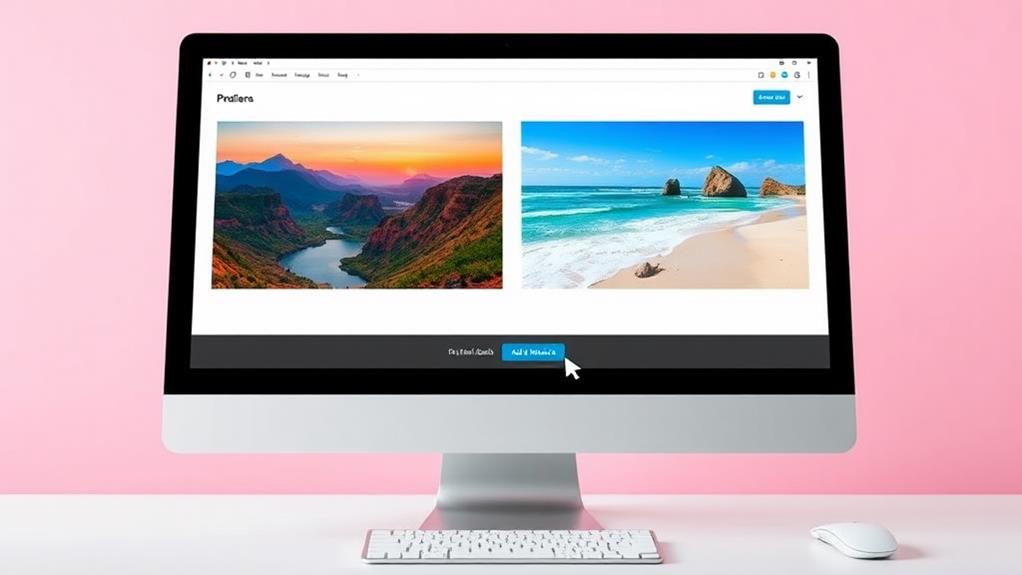
Creating a side-by-side photo in WordPress is easy and can really boost your site's visual appeal. Start by using the Block Editor: add a Column block, select two columns, and insert Image Blocks into each. You can upload new images or choose from the Media Library. Alternatively, use the Gallery Block to display multiple images. Adjust column widths and image sizes for an attractive layout that works on both desktop and mobile. If you want to troubleshoot alignment issues or explore advanced features, there's plenty more to discover that can enhance your design even further.
Importance of Side-by-Side Images
Side-by-side images play an essential role in enhancing the visual appeal of your WordPress website. When you use multiple images side-by-side, you create a dynamic layout that captures your visitors' attention. This approach makes your content more engaging and helps convey your message more effectively. By strategically placing these images, you can promote interaction with content that leads to a more immersive browsing experience.
By utilizing the Gallery block, you can efficiently display these images without overwhelming your layout. This organized structure allows your audience to compare two images directly, promoting better analysis and understanding of your work. Whether you're showcasing photography or highlighting products, side-by-side images create an aesthetically pleasing display that can notably improve user interaction.
Moreover, engaging layouts with images side by side can enhance user retention on your website. Visitors are more likely to stay and explore when they encounter visually appealing designs. The strategic use of multiple images side-by-side not only enhances the overall site performance but also encourages deeper engagement with your content.
In a world where first impressions matter, incorporating side-by-side images can set your website apart and make it more inviting for visitors.
Methods to Create Side-by-Side Images
Creating side-by-side images in WordPress can be done in several effective ways.
You can use the Gallery block for a straightforward approach, or try column alignment techniques for more flexibility.
Additionally, using a theme like Astra can enhance your blog's design, making it easier to implement such layouts.
If you want advanced options, consider plugins specifically designed for image display that can enhance your layout even further.
Using Gallery Block
If you're looking to display multiple images together in a visually appealing way, the Gallery block in WordPress is an excellent tool.
To get started, access the block editor by creating a new post or editing an existing one. Click the Add Block (+) button and select the Gallery block.
Once you're in the Gallery block, you can upload images directly from your computer or choose them from your media library. After adding your images, you can adjust the number of columns in the block settings, which will determine how many images appear side by side.
You can select between one to six columns, depending on your design preference.
Once you've configured the images and columns, make sure to click Update or Publish to save your changes. This will allow you to see how your side-by-side images look on your post or page.
For a polished final touch, consider tweaking gallery settings like margins, enabling lightbox viewing for full-sized images, and editing image titles and alt texts for better SEO.
Using the Gallery block, you can create stunning visual content with ease!
Column Alignment Techniques
To achieve a clean layout with images aligned next to each other, leveraging the Column Block in WordPress is highly effective.
Start by selecting the desired number of columns for your layout. Then, insert an Image Block into each column to seamlessly place your images side by side. If you notice any height discrepancies, adjust the column widths accordingly to guarantee a cohesive visual presentation.
Alternatively, you can utilize the Gallery Block for a similar effect. This block allows you to upload multiple images and easily adjust the number of columns in the block settings.
This flexibility helps maintain a unified layout, providing a polished look to your images.
For best results, test your selected column settings across various devices to confirm that the side-by-side arrangement remains intact on both desktop and mobile views.
Additionally, experiment with different image sizes in the Media Settings to achieve uniform heights.
Keep in mind that thumbnails and larger images can impact overall alignment, so find a balance that enhances the grid appearance.
Plugins for Image Display
When it comes to displaying images side by side in WordPress, using plugins can greatly enhance your options and flexibility.
For instance, Envira Gallery allows you to upload multiple photos and customize layouts, including column counts and lightbox settings, giving your gallery a polished look.
If you prefer a user-friendly interface, the NextGEN Gallery plugin helps you organize images into galleries, enabling various layout options like thumbnails and slideshows for side-by-side displays.
Another excellent choice is WPBakery Page Builder, which offers a drag-and-drop feature. You can easily arrange your images side by side using row and column elements, allowing for a customized layout that fits your theme.
The Jetpack plugin's Tiled Gallery feature is also worth considering; it lets you create visually appealing side-by-side images in the Classic Editor, enhancing your post's aesthetics.
Lastly, the Photo Gallery plugin is fantastic for responsive galleries, ensuring your images display beautifully on both desktop and mobile devices.
With these plugins, you'll have everything you need to create stunning side-by-side images in your WordPress gallery.
Using the Block Editor
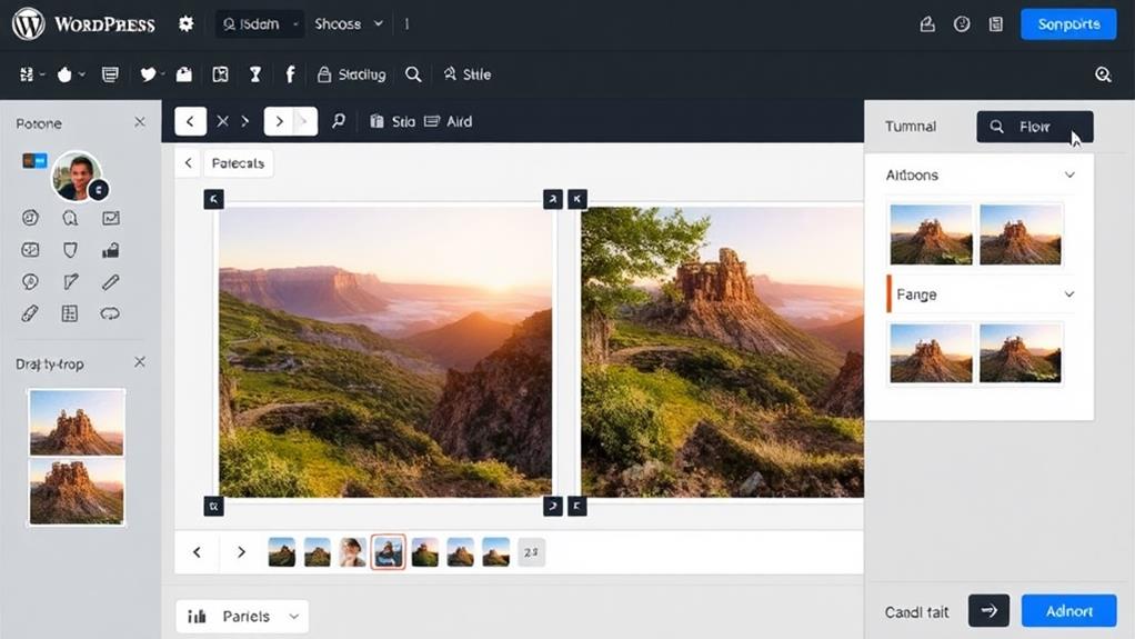
Creating side-by-side photos in WordPress with the Block Editor is a straightforward process that enhances your visual content.
To start, open the editor for your post or page and click the Add Block (+) button to create a new Column block. Once you've added the Column block, select two columns to organize how you want the images displayed side by side. This method allows for a clean layout that can effectively showcase your images and offers theme customization options to enhance your overall design.
Next, you'll need to add an image block into each column. Click within the first column area and select the Image block from the block options. Repeat this for the second column. You can upload new images from your computer or choose existing images from your Media Library to place in the Image blocks.
After you've added your images, take a moment to adjust their alignment and sizes as needed. Ensuring they fit well within the columns will help create a visually appealing layout.
Implementing a Gallery Block
Implementing a Gallery Block in WordPress can elevate your content by showcasing multiple images in a cohesive layout.
To get started, create or edit a post or page in the WordPress block editor. Click the Add Block (+) button and select the Gallery option from the menu. This will allow you to upload images directly from your computer or choose from your Media Library.
Regular backups are essential to guarantee that your media files are safe and secure, especially when integrating elements like this gallery, which can enhance your site's appearance and functionality essential features of backup plugins.
Once you've added your images, you can easily adjust the number of columns in the Gallery Block settings. This feature lets you customize how many images appear side by side, enhancing the visual appeal of your content.
After you're satisfied with your gallery setup, don't forget to click Update or Publish to save your changes.
Your side-by-side images will now be viewable on your website, creating an engaging experience for your visitors.
While the Gallery Block offers additional customization options, such as enabling lightbox settings and editing image titles for SEO, these aspects can be explored later.
For now, focus on implementing the Gallery Block to effectively showcase your images.
Customization Options for Image Galleries
Customizing your image galleries in WordPress can considerably enhance their effectiveness and visual appeal. You have several customization options to make your galleries stand out.
Start by adjusting the number of columns, which can range from 1 to 6. This flexibility allows you to create layouts that best suit your design needs, especially when using themes like Astra that offer extensive customization features.
Don't forget to edit image titles and alt text within the gallery settings. This enhances SEO, making it easier for search engines to understand your images' content.
Enabling lightbox settings is another great option; it lets users click on images to view them in full size, improving the overall user experience without disrupting the gallery layout.
You can also adjust gallery margins and enable the isotope layout, which organizes images in a visually appealing manner, creating a dynamic presentation.
If you need to modify an existing gallery, simply revisit the gallery block. You can easily add or replace images using this feature without having to reinsert the entire block into your post or page.
Alignment Techniques for Images
When aligning images side by side in WordPress, you'll want to explore different alignment options to find what works best for your layout.
Prioritize functionality aligned with website needs by using widget selection strategies to enhance the visual appeal of your post.
Keep responsive design in mind, as this guarantees your images look great on all devices.
Image Alignment Options
Aligning images properly in WordPress can considerably enhance your post's visual appeal. You have several image alignment options to choose from, making it easy to put two images side by side.
First, use the Align button in the WordPress block editor toolbar to set your images to the left or right. This technique helps you achieve a neat layout in your post column.
Make sure that the images collectively occupy the full width of the column to avoid layout issues. If needed, adjust the image sizes in Settings > Media for a suitable fit.
Each WordPress theme has specific maximum image width limitations, so it's essential to check your theme documentation to understand how it affects image alignment.
If your images appear staggered, consider employing the "clear:both" style code to create a uniform layout.
Additionally, experiment with different image sizes—thumbnail, medium, and large—to find the best combination that maintains aesthetic quality while allowing for proper alignment.
Responsive Design Considerations
Responsive design is essential for guaranteeing that your side-by-side images look great on all devices. Proper alignment is vital to maintain a cohesive layout; you want to display images together without disrupting your overall design.
To achieve this, use the Align button in the block editor toolbar to set your images to align left, right, or center, facilitating their side-by-side placement.
Make sure the combined width of your images doesn't exceed the full width of the post column. If they do, they'll stack vertically instead of displaying side by side.
To enhance alignment further, adjust your image sizes through Settings > Media. Uniformly sized images promote a cleaner, more organized layout.
If you're using multiple images and notice staggered layouts, apply the CSS style "clear:both." This guarantees that floating images don't interfere with each other, keeping everything aligned.
Remember, responsive design isn't just about how things look on desktop; your side-by-side images need to adapt gracefully to mobile screens as well.
Challenges With Image Insertion
Inserting images side by side on WordPress can be tricky, especially since many users struggle with the limited control offered by the editor. One of the main challenges you'll encounter is improper alignment and positioning of images, which can disrupt your intended layout.
The alignment options in the WordPress editor often focus more on text wrapping than on the actual positioning of images, leading to confusion. To enhance your experience, consider utilizing reliable WordPress plugins for seamless file uploads and improved management of your media files security measures for file uploads.
Many users find themselves frustrated as they attempt to place images from the media library next to each other. If you're not careful, your images may stack vertically instead of appearing side by side, making your post look unprofessional.
Some users turn to external programs as a workaround, creating side-by-side images before uploading them to WordPress.
Additionally, understanding your theme specifications is essential. Some themes may not support ideal side-by-side image placement, further complicating the process.
You'll want to check maximum image widths to verify your images fit the layout you envision. By being aware of these challenges, you can better navigate the process of inserting images side by side in WordPress.
Adjusting Image Sizes for Layout
Achieving the perfect layout for side-by-side images in WordPress often hinges on adjusting their sizes effectively. To do this, navigate to Settings > Media, where you can set default thumbnail, medium, and large sizes. This guarantees that your images fit well within your layout.
For square images, use the thumbnail size to create a uniform grid, enhancing the visual appeal when you put images side by side. Additionally, utilizing theme customization options can further enhance the arrangement of your images, allowing for more flexibility in your layout design.
Make sure the images in your gallery or columns don't exceed the 'Large' size. This helps maintain ideal performance and prevents misalignment in your layout. Consistency in image dimensions is key; it creates a cohesive and aesthetically pleasing presentation.
Don't hesitate to experiment with different image sizes in your posts. This trial-and-error approach allows you to find the best configuration that aligns your images properly, fitting neatly within designated column widths.
Theme Considerations for Image Display
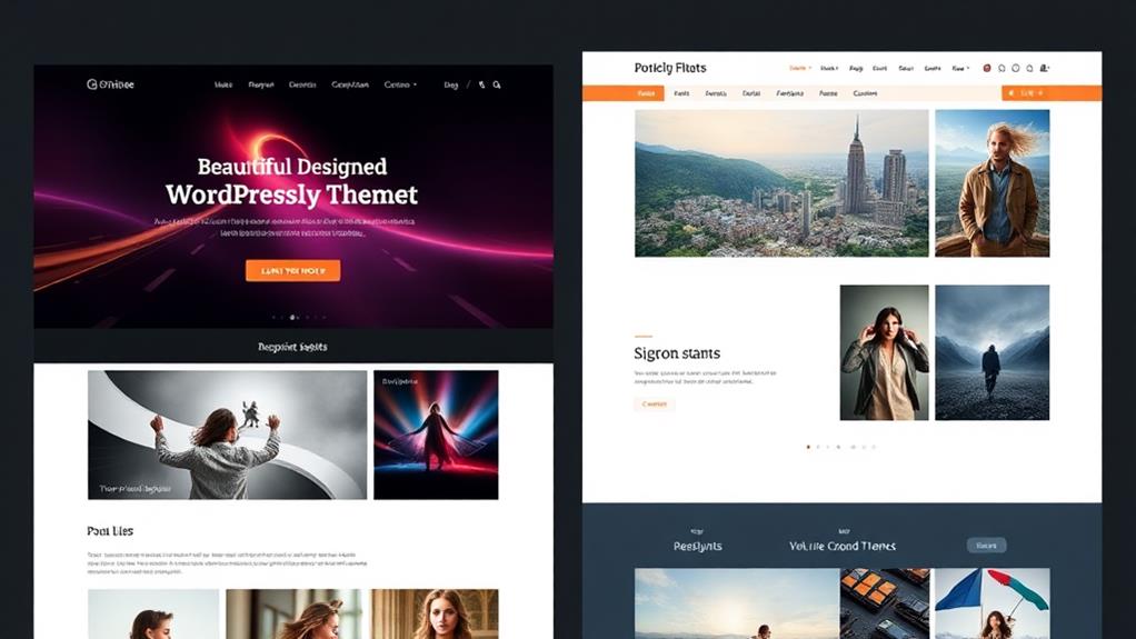
When choosing a WordPress theme, understanding its image display capabilities is essential for creating effective side-by-side layouts. Each theme has a defined maximum image width, which can limit how your images are displayed.
That's why it's important to grasp the specific image handling features of your chosen theme for ideal photo placement and alignment. Themes like Astra offer lightweight designs that promote rapid loading performance, making them suitable for image-heavy layouts.
Some themes come with built-in support for advanced image alignment features, making it easier to create side-by-side layouts. However, not all themes are equal, so you should review the theme documentation thoroughly. This will help you identify any limitations or special settings that could impact image display.
Another important factor is theme responsiveness. It can greatly affect how images stack on mobile devices, which is essential for reaching your audience effectively.
If your theme isn't mobile-optimized, your side-by-side images mightn't look great on smaller screens.
Community Resources and Support
When you're working on aligning images in WordPress, tapping into community forums can be a game changer.
You can find support documentation and share tips with fellow users who've faced similar challenges. Engaging with others not only enhances your skills but also helps you troubleshoot specific issues more effectively.
Additionally, it's crucial to be aware of common vulnerabilities that could affect your site while you experiment with image layouts.
Community Forums Engagement
Community forums frequently serve as invaluable resources for WordPress users looking to enhance their skills and troubleshoot issues, particularly when it comes to displaying side-by-side photos. By participating in these forums, you can ask questions and share solutions with fellow users who've faced similar challenges.
If you're struggling with using the gallery feature or need tips on how to change the number of images displayed, these forums are a goldmine of information. Many community members offer personal insights and best practices for image alignment, helping you find targeted advice for your specific needs.
You'll often discover new plugins that can make your side-by-side photo display even more efficient. Engaging with others not only helps you resolve your queries but also fosters a supportive environment for ongoing learning.
Don't hesitate to plunge into discussions about the new gallery options available in WordPress. The collective experience and innovative solutions shared by fellow users can greatly enhance your ability to display images effectively.
Support Documentation Access
Accessing support documentation is essential for mastering the art of displaying side-by-side photos in WordPress. The WordPress support page offers detailed guidelines on image alignment and various methods for showcasing your images effectively.
If you're trying to use the new Gallery button, this resource is invaluable. It details how to Create Gallery and arrange your images for the best visual impact.
Additionally, the Jetpack plugin can enhance your experience by enabling features like the Tiled Gallery. Check the Jetpack support site for documentation on how to maximize these capabilities.
If you prefer learning through videos, YouTube has numerous tutorials that explore using the WordPress block editor, including steps on creating galleries perfect for side-by-side displays.
Don't underestimate the power of community resources. Engaging with others in forums can lead to practical advice and shared solutions for common image placement and alignment issues.
User Tips Sharing
To enhance your experience with side-by-side photo displays in WordPress, engaging with user tips and shared resources can be incredibly beneficial.
Start by diving into community forums where you can seek advice and share experiences related to photo alignment and side-by-side image placement. You'll find many users willing to help with the nuances of using WordPress for your projects.
Don't overlook WordPress support pages, which provide thorough guidelines on image settings and alignment. These resources can greatly improve how you add two images side by side.
For hands-on learning, explore educational video tutorials on YouTube that focus on the WordPress block editor and image management techniques.
Additionally, consider participating in monthly contests hosted by WPBeginner. Not only can you showcase your skills, but you could also earn valuable resources, such as premium plugin licenses, which may enhance your image handling capabilities.
Conclusion
Creating side-by-side photos in WordPress is like assembling a vibrant mosaic. Each image, a unique tile, contributes to the overall masterpiece of your content. With the right tools and adjustments, you can craft a visual story that captivates your audience. Don't shy away from exploring customization options and community support; they're the brushes that help you refine your artwork. Embrace the journey, and let your images dance together in harmony across your site!

