When honing your page layout in WordPress, prioritize these five tips. Keep margins and paddings consistent for a polished appearance. Utilize absolute positioning to control element placement precisely. Enhance user engagement by employing sticky elements and parallax effects. Seek feedback from the WordPress community and explore licensing options for design enhancements. Guarantee cross-device compatibility for a seamless user experience. Mastering these fundamental tips will elevate your website design to the next level, engaging visitors and enhancing user experience.
Consistent Margins and Paddings
To achieve a polished and professional appearance on your WordPress website, make sure that margins and paddings remain consistent throughout your layout. Web design relies heavily on the use of margins and paddings to create a visually appealing and clean design.
Margins play a vital role by pushing elements away from each other, allowing for a well-structured layout that enhances the overall visual appeal of your website. On the other hand, paddings provide internal space within elements, improving readability and preventing a cluttered appearance.
Consistency in the application of margins and paddings is key to maintaining a professional look across your website. By ensuring that these spacing elements are uniform throughout your layout, you can achieve a cohesive design that enhances the user experience.
Without proper attention to margins and paddings, elements on your website may appear cramped or disjointed, detracting from the overall aesthetic and functionality of your site. Understanding the difference between margins and paddings is essential for creating a visually pleasing layout that captivates visitors and reinforces your brand's image.
Utilize Absolute Positioning
When designing your WordPress layout, consider employing absolute positioning to precisely control element placement within content boxes. Absolute positioning in WordPress allows you to achieve specific layout effects and guarantees that elements remain in fixed locations on the page.
While it may not be essential for all elements, using absolute positioning can help you maintain a consistent design across different devices. You can utilize absolute positioning to bring elements forward on the page by adjusting the z-index property, which determines the stacking order of elements. This technique is vital for achieving a custom and polished design for your WordPress website.
Implement Sticky Elements and Parallax

Enhance your WordPress pages with sticky elements and parallax effects for increased user engagement and visual interest. By utilizing Thrive Architect, you can implement sticky elements that keep specific page elements or even entire sections fixed as users scroll through your WordPress website. This feature enhances the interactive design of your site, providing a seamless user experience. Additionally, the parallax effect offered by Thrive Architect adds depth and movement to backgrounds, elevating the visual appeal of your pages.
Thrive Architect goes beyond standard sticky elements by offering unique techniques like sticky columns, which further enhance the interactive design possibilities for your WordPress website. Implementing sticky elements and parallax not only makes your site visually appealing but also increases user engagement by creating dynamic and captivating content. These features work together to create a more immersive browsing experience for your visitors, encouraging them to explore your content further.
Seek Community Feedback and Licensing
Engaging with the WordPress community is crucial for gathering valuable feedback on your page layout and exploring licensing options for enhanced design capabilities. Seeking input from the community on your WordPress site's page layout can provide you with valuable insights and suggestions for improvement. By obtaining licensing for tools like Thrive Architect, you can enhance your page layout capabilities and access premium features to elevate your design.
Reviews from the community can help you make informed decisions to improve your page layout and design choices. Actively connecting with the WordPress community to gather feedback and refine your page layout design effectively is vital. Utilizing licensing options not only supports the development of your WordPress page design but also opens up opportunities to implement advanced features that can take your website to the next level.
Make the most of community insights and licensing resources to refine and perfect your page layout for a more engaging and visually appealing WordPress site.
Optimize for Cross-Device Compatibility

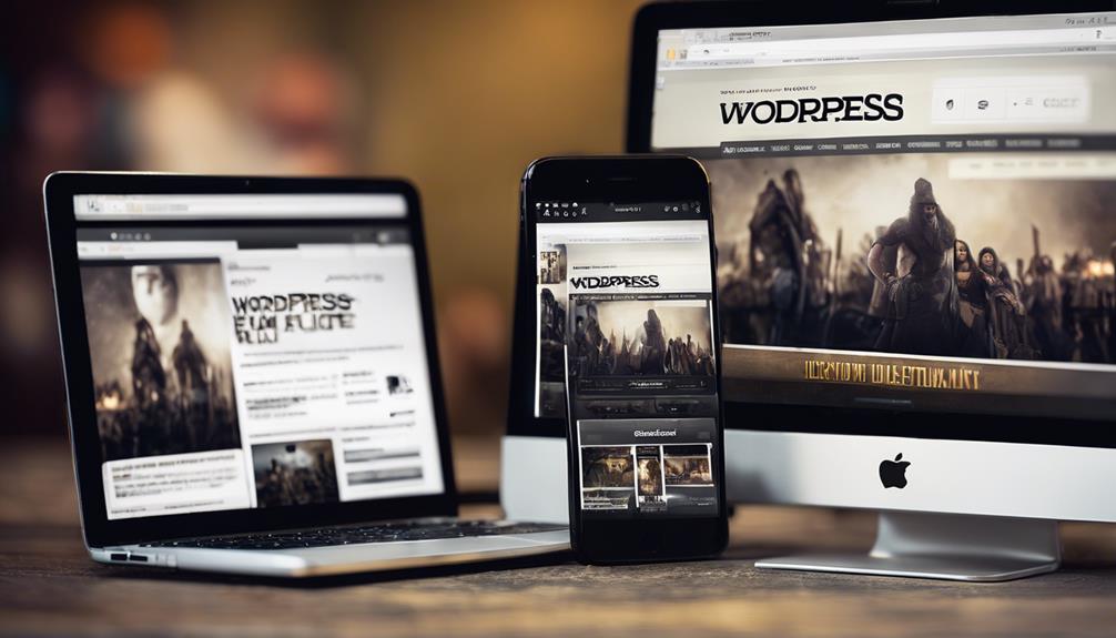
To guarantee a seamless user experience across all devices, focus on optimizing your page layout for cross-device compatibility through responsive design techniques.
Here are some tips to make sure your WordPress website is well-optimized for different devices:
- Utilize responsive design: Make certain your page layout adjusts to various screen sizes for a consistent user experience.
- Test on different devices: Check how your layout appears on various screens to ensure it looks good everywhere.
- Use flexible grids and images: Opt for elements that can adapt to different device sizes effortlessly.
- Implement media queries: Adjust the styling of your website based on the screen width of the device for optimal viewing.
Conclusion
To sum up, remember that 'practice makes perfect' when it comes to perfecting your page layout in WordPress.
By following these tips and continuously tweaking your design, you'll be on your way to creating a visually appealing and user-friendly website.
Don't be afraid to seek feedback from the community and always keep in mind that 'good design is obvious, but great design is transparent.'
Keep working at it, and you'll see your website shine!


