
When designing your WordPress site, consider font styles like Roboto for a modern, clean look. Poppins offers versatility with 18 weights for bold headlines. Merriweather's subtle diagonal stress enhances readability, while Montserrat's sleek lines are ideal for impactful headlines. Open Sans' simplicity and legibility make it a solid choice. Choosing the right font style enhances the visual appeal for your audience.
Roboto
If you're aiming for a modern and clean look on your WordPress website, consider incorporating Roboto, a futuristic font with a geometric typeface design and open curves. Roboto isn't only visually appealing but also designed for easy reading, making it ideal for body content. Its natural appearance and readability make it a popular choice, especially for online businesses. Being the default font for Android and Chrome OS, Roboto guarantees consistency and readability across various devices, which is vital in today's digital landscape.
Moreover, the geometric design of Roboto lends itself well to headlines, taglines, and maintaining a professional appearance on websites. Its clean and simple aesthetic makes it versatile and suitable for various types of content. To create a cohesive design, Roboto can be paired with fonts like Raleway, Lora, Rokkit, Space Mono, and Archivo. By choosing Roboto for your website, you're not only embracing a modern look but also ensuring readability and a polished feel throughout your online presence.
Poppins
Poppins, a versatile and popular WordPress font, is admired for its clean geometric design and impressive range of 18 font weights. This modern and professional font is perfect for creating bold headlines that demand attention on your website. Poppins' sleek lines and geometric structure make it an ideal choice for enhancing the visual appeal and legibility of your content.
When pairing Poppins with other fonts in your WordPress design, consider combinations like Open Sans, Droid Serif, PT Sans, and Playfair Display for a cohesive and polished look. These combinations can help you create a harmonious typography style that elevates the overall aesthetics of your site. Widely used in websites and printed materials, Poppins offers a wide range of options to play with, allowing you to experiment with different font weights to achieve the desired impact.
Make the most of Poppins' versatility and range to create engaging and impactful typography in your WordPress design.
Merriweather
Merriweather, a modern font tailored for screens, offers tall letters and a subtle diagonal stress to enhance readability, making it a versatile choice for websites.
Whether for body content or headlines, Merriweather provides a clean and sophisticated aesthetic that's perfect for various design styles. This font is known for its ability to convey a sense of modernity while also exuding traditional elegance, making it suitable for a wide range of industries.
When paired with fonts like Roboto or Open Sans, Merriweather creates a balanced and professional look that enhances the overall design of your website. Its versatility and readability make it a popular option among designers looking to establish a polished and contemporary appearance.
Consider using Merriweather if you want to achieve a refined and sophisticated look for your WordPress site.
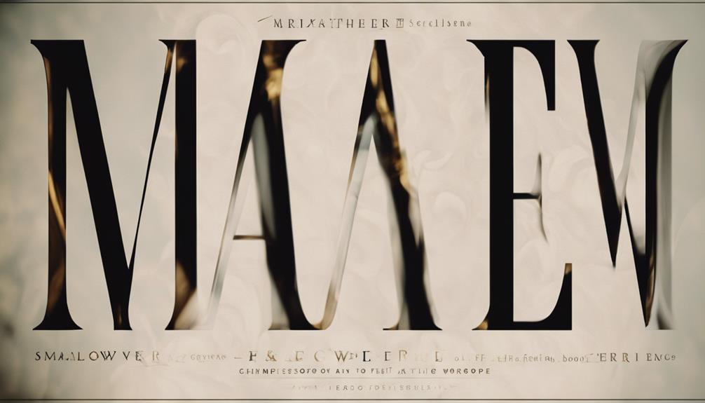
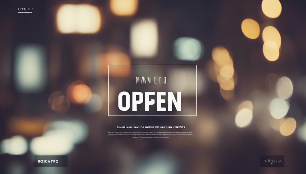
Montserrat
When looking to create impactful headlines on your website, consider incorporating the highly popular geometric sans-serif font, Montserrat. Montserrat is one of the best fonts to use for making your headlines stand out. Its sleek and modern look can make a good impression on your audience.
This font is widely used and is even the official font for the government of Mexico. The clean lines and distinct characters of Montserrat can make a difference in how your website is perceived. Pairing Montserrat with fonts like Open Sans, Lato, or Roboto can create a visually appealing hierarchy on your site.
With its contemporary and youthful look, Montserrat is ideal for attracting a younger demographic. Using Montserrat can help set your website apart and make a strong visual impact on your visitors.
Open Sans
Open Sans stands out as a versatile and widely acclaimed font choice for enhancing the readability and visual appeal of your WordPress website design. Here are some reasons why Open Sans is a popular choice:
- Clean and Simple Design: Open Sans is known for its clean and straightforward design, making it perfect for websites that aim for a modern and sleek look.
- Excellent Legibility: This font offers excellent legibility on screens, ensuring that your website content is easy to read and comprehend for visitors.
- Pairs Well with Other Fonts: Open Sans is a versatile font that pairs well with various other fonts like Montserrat, Bitter, Domine, Sans Pro, and Lato, allowing you to create visually appealing combinations.
- Various Weights Available: With Open Sans, you have access to various weights, making it suitable for different types of content and text-heavy websites.
Conclusion
Overall, choosing the right font style for your WordPress design can make a huge difference in the overall look and feel of your website. Remember, 'the devil is in the details' when it comes to design, so don't overlook the importance of selecting the perfect font.
Experiment with different styles and see which one best suits your brand and message. Your readers will thank you for it!